Why this distribution matters so much
If you study statistics or machine learning long enough, one curve keeps showing up everywhere:
the bell-shaped normal distributionIt appears in measurement errors, exam scores, heights, sensor noise, regression residuals, and many business metrics that come from many small factors acting together.
This post builds on earlier ideas like probability distributions and probability density functions, then moves into the practical side:
- what the normal distribution is
- what mean and standard deviation actually control
- how the standard normal variate and z-score help us compare data
- how the
68-95-99.7rule works - how skewness changes the story
- how the CDF turns curves into usable probabilities
- how data scientists use all of this in the real world
Quick recap: PDF and 2D density plots
Before the normal distribution, it helps to remember what a probability density function (PDF) means for a continuous variable.
For continuous data, the probability at one exact value is not the important thing. What matters is the area under the curve across a range.
So when we say:
P(20 < X < 25)we mean:
the area under the PDF between 20 and 25That is why the total area under any valid PDF must equal 1.
When two numerical variables are involved, we often move from a 1D density curve to a 2D density plot or contour plot. Instead of showing how one variable is distributed, it shows where pairs of values are concentrated.
A simple example:
- x-axis: hours studied
- y-axis: exam score
If the densest contour region sits around (6 hours, 78 marks), that tells us many students cluster near that combination. In data science, 2D density plots are helpful when we want to understand how two numeric variables move together without plotting every point individually.
What is the normal distribution?
The Normal Distribution, also called the Gaussian Distribution, is a continuous probability distribution defined by two parameters:
mu(mean): the center of the distributionsigma(standard deviation): how spread out the data is
Its PDF is:
f(x) = (1 / (sigma * sqrt(2pi))) * e^(-(1/2) * ((x - mu) / sigma)^2)You do not need to memorize the formula to understand the idea. The important intuition is this:
- the mean decides where the center of the bell sits
- the standard deviation decides whether the bell is narrow or wide
If sigma is small, most values stay close to the mean and the curve looks tall and narrow.
If sigma is large, values spread farther away from the mean and the curve becomes wider and flatter.
This distribution is famous because it is:
- symmetric
- bell-shaped
- mathematically convenient
- surprisingly common in nature and measurement processes
Classic textbook examples include:
- adult heights
- IQ scores
- measurement noise from sensors
- small manufacturing variations around a target value
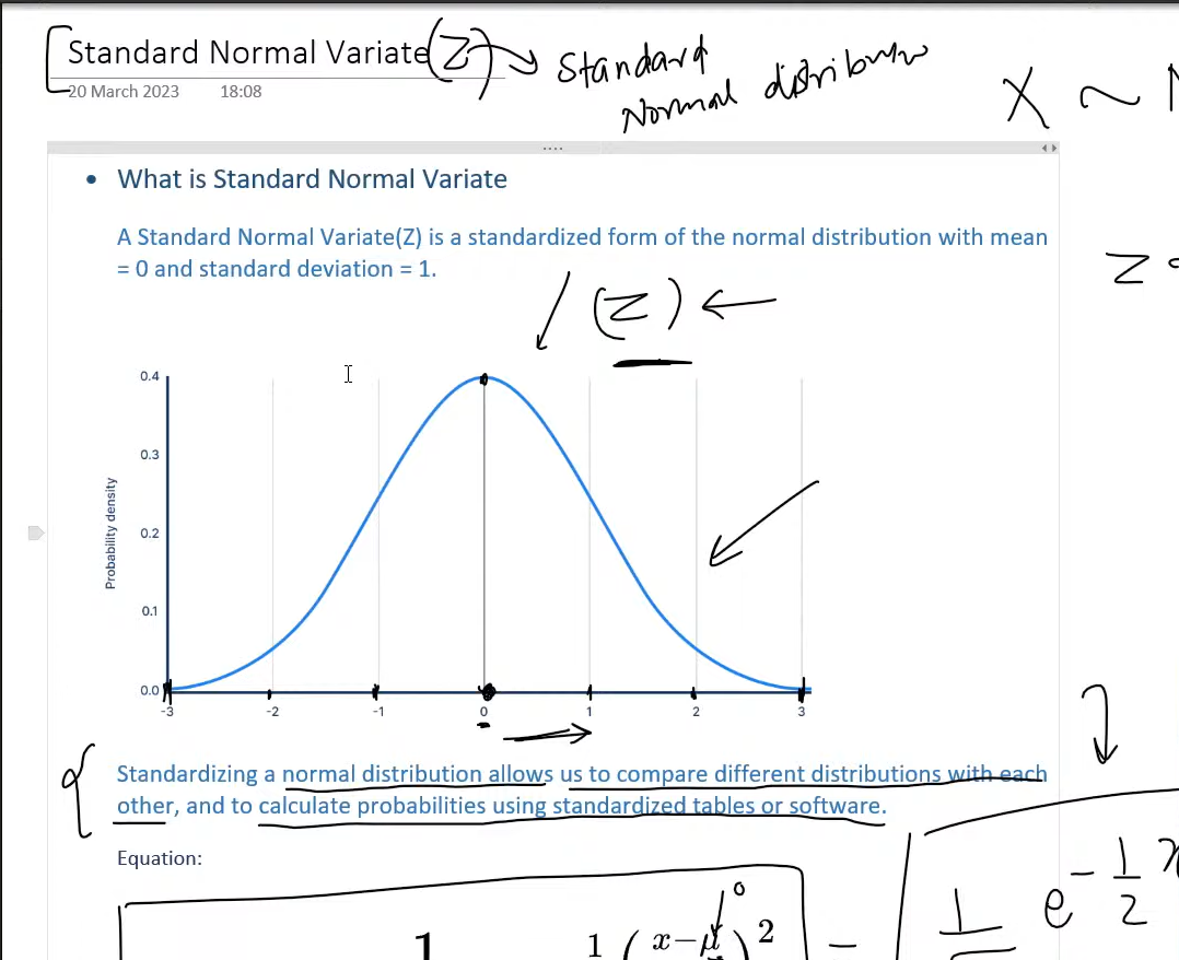
Reading the standard normal variate
One of the most useful ideas in statistics is the Standard Normal Variate, usually written as Z.
That is just a normal distribution that has been standardized so that:
mean = 0
standard deviation = 1
The conversion rule is:
z = (x - mu) / sigmaThis tells us how many standard deviations a value is above or below the mean.
Why is this so useful?
Because raw values from different datasets are often not directly comparable.
Suppose two students each score 88, but they took different exams:
| Exam | Mean | Standard deviation | Raw score | Z-score |
|---|---|---|---|---|
| Statistics | 80 | 4 | 88 | (88 - 80) / 4 = 2.0 |
| Economics | 70 | 10 | 88 | (88 - 70) / 10 = 1.8 |
Both students scored 88, but the statistics student performed slightly better relative to their class distribution.
That is the real power of standardization:
it turns raw values into relative positionOnce data is in z-score form, we can use:
- z-tables
- calculators
- Python, R, Excel, or statistical software
to quickly compute probabilities.
The empirical rule: 68-95-99.7
For a normal distribution, there is a famous shortcut called the Empirical Rule:
- about
68%of values lie within1standard deviation of the mean - about
95%lie within2standard deviations - about
99.7%lie within3standard deviations
If:
X ~ N(100, 15^2)then roughly:
68%of values are between85and11595%are between70and13099.7%are between55and145
This rule gives fast intuition even before touching a calculator.
Imagine a factory filling juice bottles with a target of 500 ml, and the fill amount is approximately normal with:
mu = 500
sigma = 4
Then:
- most bottles should fall between
496and504 ml - nearly all should fall between
488and512 ml
If the team suddenly sees many bottles below 488 ml, something is probably wrong with the filling machine. That is the empirical rule turning a curve into an operational quality check.
Core properties of the normal distribution
The normal distribution has a few properties worth remembering because they appear again and again in machine learning and statistics.
1. It is symmetric
The left and right sides mirror each other around the mean.
That means:
P(X < mu - a) = P(X > mu + a)for the same distance a.
2. Mean, median, and mode are equal
In a perfectly normal distribution:
- mean = median = mode
They all sit at the center of the bell curve.
3. Total area under the curve is 1
This is what makes it a valid probability distribution.
4. The tails never truly touch the x-axis
The probability becomes extremely small far from the mean, but mathematically the curve keeps extending forever.
Skewness: when data stops being symmetric
The normal distribution is symmetric, but many real datasets are not. That is where skewness comes in.
Skewness measures how much a distribution leans to one side.
Positive skew
Also called right skew.
- most values cluster on the left
- the long tail stretches to the right
Common examples:
- income
- house prices
- response times when most requests are fast but a few are very slow
Negative skew
Also called left skew.
- most values cluster on the right
- the long tail stretches to the left
One example is a very easy exam where most students score high but a smaller group scores much lower.
This matters because many statistical methods assume data is at least approximately normal. If the data is strongly skewed, then:
- the mean can be misleading
- z-score interpretations can weaken
- normal-based hypothesis tests may become less reliable
In practice, teams may then use:
- log transforms
- robust statistics
- non-parametric tests
instead of blindly forcing a normal assumption.
CDF: from density to probability
The Cumulative Distribution Function (CDF) answers a different question than the PDF.
Instead of asking:
how dense is the curve at x?it asks:
what is the probability that X is less than or equal to x?So:
F(x) = P(X <= x)That makes the CDF incredibly practical.
Suppose delivery times in a city are approximately normal:
X ~ N(30, 4^2)What is the probability a delivery arrives within 38 minutes?
First standardize:
z = (38 - 30) / 4 = 2From the standard normal CDF:
P(Z <= 2) ≈ 0.9772So:
P(X <= 38) ≈ 97.72%That also means the probability of taking longer than 38 minutes is:
1 - 0.9772 = 0.0228or about 2.28%.
This is exactly why people love the CDF:
it converts a distribution into a decision-ready probabilityA real data science scenario: delivery-time modeling at a food app
Let us make this concrete with a realistic data science workflow.
A food delivery company builds a model to predict total delivery time using features such as:
- distance
- restaurant preparation time
- traffic level
- weather
- rider availability
After training a linear regression model, the team studies the residuals:
residual = actual delivery time - predicted delivery timeIf the model is well behaved, the residuals should be centered near zero and often look approximately normal.
Why does that matter?
Because now the team can reason about unusual errors using z-scores and probabilities.
Assume the residuals look like:
Residual ~ N(0, 5^2)That means:
- most predictions are within
5minutes of reality - about
95%are within10minutes - very large misses are rare
Now imagine one order was predicted to take 24 minutes but actually took 37.
The residual is:
37 - 24 = 13Convert it to a z-score:
z = (13 - 0) / 5 = 2.6A residual of 2.6 standard deviations above the mean is unusual. The upper-tail probability is less than 1%, so this order is a good candidate for investigation.
The operations team might discover:
- the rider waited too long at pickup
- heavy rain slowed traffic
- the restaurant underestimated prep time
Now the normal distribution is not just a theory chapter anymore. It becomes a business tool.
The same team can also use related ideas in three ways.
First, a 2D density plot of predicted time vs actual time can show whether most orders cluster near the ideal diagonal.
Second, the residual histogram can show whether the model errors are reasonably close to normal or clearly skewed.
Third, the team can run hypothesis tests after shipping a new routing feature:
- null hypothesis: average residual stayed the same
- alternative hypothesis: average residual improved
Because normal assumptions often sit underneath confidence intervals, z-tests, and regression diagnostics, understanding this curve directly improves how the team evaluates model quality.
Where the normal distribution shows up in data science
Here are some of the most common places you will see it in practice:
- Regression residuals: many linear-model diagnostics assume residuals are roughly normal
- Hypothesis testing: z-tests, confidence intervals, and sampling distributions often rely on normal approximations
- Anomaly detection: extreme z-scores can help flag rare events
- Feature standardization: many workflows standardize variables to mean
0and standard deviation1 - Measurement noise: sensor and experimental error is often modeled as Gaussian noise
That does not mean every dataset is normally distributed. It means the normal distribution is often the best first mental model.
Final takeaway
The normal distribution matters because it gives us a clean bridge between:
- raw measurements
- relative position through z-scores
- practical probability through the CDF
- operational decisions in real systems
If you remember only a few ideas, keep these:
- a normal distribution is controlled by
muandsigma - standardization turns raw values into comparable z-scores
- the
68-95-99.7rule gives quick intuition - skewness tells you when normal assumptions are breaking
- the CDF is what turns the curve into probability answers
Once those pieces click, a huge part of classical statistics and practical machine learning becomes much easier to reason about.